Liquid Glass is broken and we are all Apple’s beta testers now
The company’s new user interface is unfinished, unimpressive and unnecessary – who does this serve and can it still be saved?
KOSTAS FARKONAS
PublishED: September 25, 2025
One week. One week of normal, everyday use – plus some experimenting on specific things having to do with productivity and gaming – to see how all of this works out. That’s how long yours truly had convinced himself he’d wait before writing anything about Liquid Glass, Apple’s redesigned user interface every single one of its new operating systems now depend on. One week.
Well, it’s been a bit more than a week since I installed iOS 26 on the iPhone 16 Pro Max, iPadOS 26 on the M4 iPad Pro 13 and tvOS 26 on the Apple TV 4K – and now I need to write about Liquid Glass because Apple’s new design system is almost everything I was afraid it would be, almost nothing I was hoping it could be and a couple of things I did not expect it to be. Yes, all at the same time. Here are the reasons why.
Impact on performance and battery life: imperceptible and tolerable respectively
First things first, then: Liquid Glass is not at all bad when it comes to performance. The new user interface is clearly more demanding in system resources than its predecessor, but it didn’t slow things down on either the smartphone or the tablet I use daily. The operating speed of Apple TV 4K was seemingly not affected by the transition to tvOS 26 either, a definite plus.
Granted, this hands-on experience is based on powerful, fairly recent Apple devices, so I’m not in a position to say if that’s the case for older iPhones and iPads. But in a couple of days after the trouble-free, uneventful upgrade from iOS 18.6 (once the system re-indexing finished and apps started being cached properly) both iOS 26 and iPadOS 26 behaved pretty much like their predecessors did. No inexplicable delays, no weird pauses, no jerky scrolling, no drops in gaming performance. So far so good.
Since Liquid Glass did not prove to be as taxing on Apple hardware as its first beta versions implied, battery life also didn’t take as big of a hit as many of us were almost certain it would. Yes, there is a difference of about 2-2.5 hours on the iPhone 16 Pro Max – it now reaches 10% around 6.00PM instead of the previous 8.00-8.30PM on a full night charge – but it’s one most people can live with. Definitely not as bad as yours truly was worried it would be – and the iPad seemed to be even less affected.
Contrary to what many of us expected, Liquid Glass does not seem to be unreasonably demanding on system resources.
Again, I can’t attest to this being the case for other devices – my wife’s experience on the 15 Pro Max and the 14 Pro Max is different, for instance, as is my son’s on an M1 iPad Pro and my daughter’s on an older iPad Pro – and reports from around the Web are all over the place when it comes to battery life on iOS 26/iPadOS 26, but I’m only reporting my own findings here. In terms of performance and battery life, Liquid Glass actually works fine for me personally. It’s other stuff about it I take issue with.
It is pretty, but why is it unfinished and what good is it for, exactly?
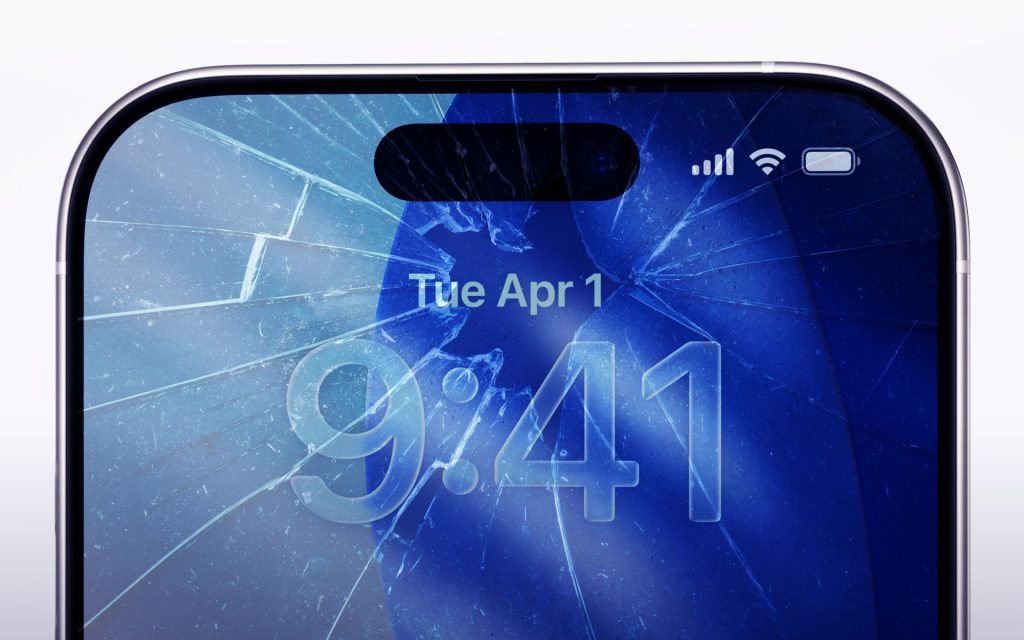
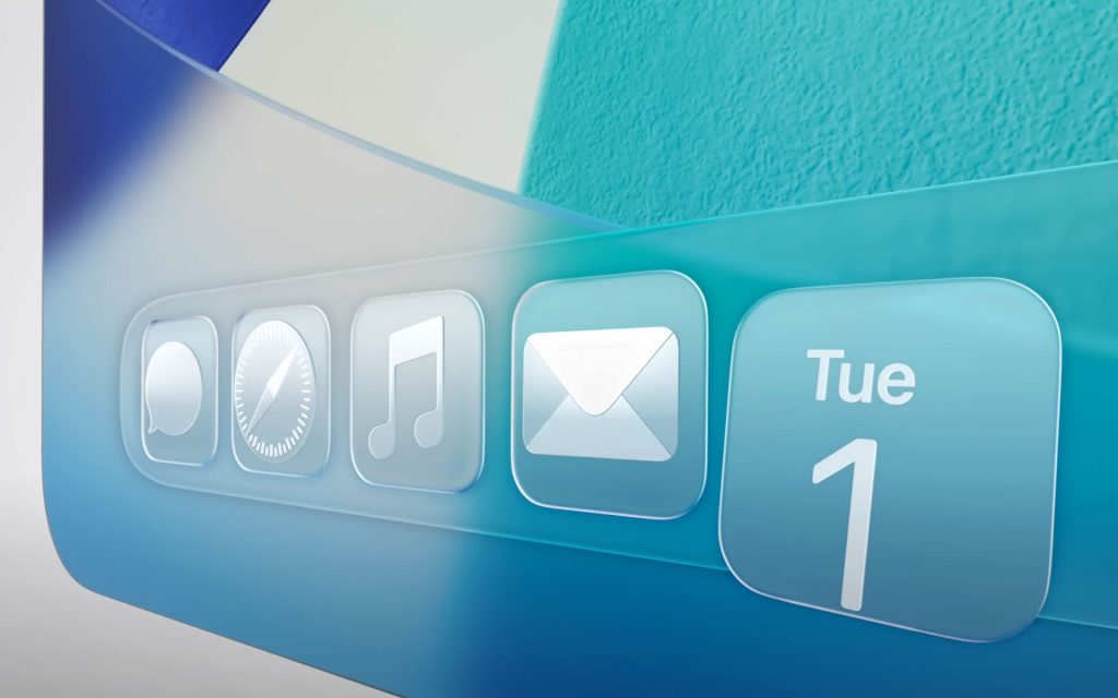
There are many things that are wrong with Liquid Glass, most of them well-documented already. It is wildly inconsistent in the way it works across different parts of any Apple OS 26, even when it comes to simple tasks and everyday stuff. There are various readability issues in many, many situations depending on backgrounds, individual app user interfaces, whether consumers use the Dark Mode or not… the list is long. Even the new UI’s signature characteristics – transparency, translucency and light refraction – don’t always work in the way one would expect them to, which is so odd since that was the whole point of their use.
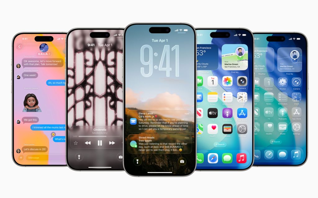
It’s clear as day that there’s quite a bit of work to be done before everyone can call this new user interface coherent, immediately accessible and instinctively usable. The previous user interface was rough in the beginning too – and it took Apple a good while to polish – but its concept was not hard to grasp or convey: iOS and iPadOS went from skeuomorphism to minimalistic flat design and, regardless of anyone’s objections in terms of aesthetics, few people had trouble actually using the new OS versions. Apple went for something much more complex with Liquid Glass and it will likely take the company even more time to figure everything out.
What’s truly disappointing about Apple’s user interface, though, is this: it may look nice and lively but, in terms of new functionality and added value, it seems almost pointless. Yours truly was concerned that Liquid Glass would end up being just a lick of fresh paint if the redesigned UI did not make things easier better or faster for consumers… and that’s exactly what happened.
Liquid Glass fails to deliver anything of note in terms of actual value to consumers.
Case in point: there’s not a single new feature in iOS 26 and iPadOS 26 that actually needs the new UI in order to work and, as a result, couldn’t work with the previous UI. Liquid Glass adds no value to the user experience of Apple’s devices – just a short-lived sense of novelty that wears thin quickly. If that is not the definition of aimless design, then I don’t know what is.
A user interface that’s problematic on a concept level
So Liquid Glass is not just unpolished but clearly unfinished – in dire need of fixes, adjustments and general tweaking in order to work as intended – but that is not its only problem. A different problem becomes apparent if someone spends some time with it on different devices and, as a result, on different screens: as yours truly was afraid that it would be the case from the very beginning, Liquid Glass simply does not look the same on an iPhone, an iPad, an Apple Watch or on the screen of a big TV. If Apple’s intention was to “unify” the look of its operating systems, then a lot of people won’t be able to even tell whether it succeeded or not.
This is readily evident in the way Liquid Glass looks at the extremes: that is, on the smallest possible and one of the largest screens possible today. Yours truly played with his wife’s Apple Watch 10 for a day and the Apple TV 4K connected to his 98-inch 4K TV for a whole weekend and, well, Liquid Glass is barely there in both cases. Granted, complications and full screen TV apps on the Apple Watch and the Apple TV 4K respectively do not take advantage of the new UI in the same way an iPhone, an iPad or a Mac do, but it’s still jarring to see that the “unified look” Apple went for is basically nowhere to be found.
Which begs the question: was it ever possible for Liquid Glass to actually look the same on such a wide range of different screens anyway?
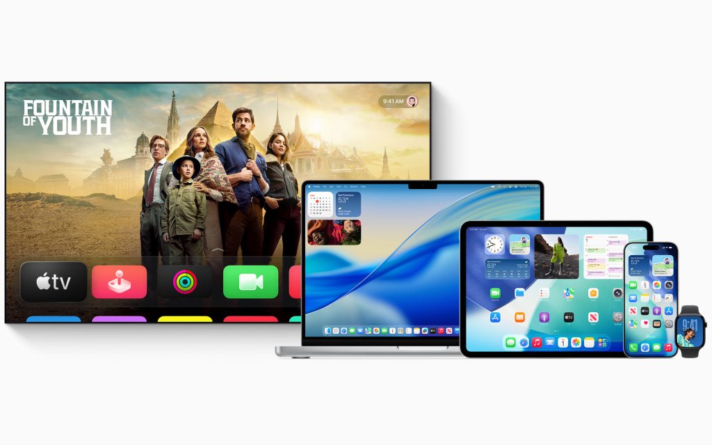
Even on the iPhone and the iPad, though, Liquid Glass just looks different. It all comes back to the original inspiration for Liquid Glass, which was the user interface of the Apple Vision Pro. In an AR/VR environment it makes sense to emulate how physical objects and light interact because (a) UI elements actually need this in order to maximize usability and because (b) there’s just so much available space to accommodate these elements. On an iPhone the available screen estate just isn’t enough, so Liquid Glass ends up getting in the way – a cardinal sin in the world of user interfaces, which are supposed to not get in the way of interactivity paths and content as much as humanly possible.
Admittedly on the iPad Pro it’s not that bad, even if it still feels forced (I suspect that this is more or less the case for Macs too). On a regular iPad or iPad Mini it might be OK, but… is this where we are now with Apple’s user interfaces? Are we to just tolerate them? See, there’s this notion of surrender – for lack of a better word – on the Web regarding Liquid Glass, expressed by comments along the lines of “Yeah, it’s not great, but *shrugs* we’ll eventually get used to it”, which is frankly infuriating. No. We are not supposed to put up with something we’ll be interacting with every single day for the foreseeable future. Apple needed to do better. It did not.
Was it ever truly possible for Liquid Glass to actually look the same on such a wide range of different screens anyway?
That’s why it seems that the release of Liquid Glass actually serves Apple more right now than it does its customers: the hundreds of millions of consumers using its devices. Apple gets to reap the PR benefits of offering a refreshed look for its operating systems (without extending their functionality) and it gets to gather all the feedback it needs for free in order to actually finish the development of Liquid Glass in due course.
Yours truly does not really believe that Apple also released the more resource-demanding Liquid Glass in order to decrease the battery life of older devices (indirectly encouraging their owners to purchase new ones), but… it would make for a nice little bonus for its bottom line long-term, no?
So what can or should consumers do for now?
Whatever the case may be, these are the choices Apple customers now have at their disposal. Owners of iPhones, iPads, Macs and Apple TV devices who have already upgraded to Liquid Glass may still be able to downgrade to the previous version of the latest operating systems for a few more days (until Apple stops offering signed versions of their previous firmware).
Owners of Apple Watch seemingly don’t have an easy way to downgrade available to them at the moment, while downgrading an Apple TV is a more involved process compared to iPhones, iPads and Macs.
People who have not upgraded to Apple’s Liquid Glass-infused operating systems obviously have more options. They can wait for a couple of months so Apple can fix the most obvious Liquid Glass issues – as well as any other performance or battery life problems relate to this new UI – and make the jump then. Or, if they are satisfied with the battery life of their current devices and the feature set offered by the 18.7 versions of their operating systems, they can also not upgrade to the new versions anytime soon or even at all (it’s not a mandatory upgrade for now).
Truth be told, consumers choosing to do the latter would not be missing much: in terms of functionality, the only really useful new feature – one worth upgrading to iOS 26/iPad OS 26/macOS 26 for – is Live Translation. Everything else is either experimental, inconsequential or a work-in-progress right now. It is as simple as that.
People choosing to postpone the upgrade to Apple OS 26 because of Liquid Glass will not be missing much in terms of new functionality.
There’s always a slight chance that is might change in the future, yes. Historically, though, Apple is not in the habit of adding major new features to its operating systems after their latest versions have been released: it will provide fixes, optimizations and security updates, it will (try to) complete half-baked features that don’t deliver their originally promised functionality… but that’s pretty much it.
Based on past experience it’s fair to say that, by the time all of that is done, next year’s WWDC event is but a few months away. Here’s hope that, come June 2027, this broken Liquid Glass user interface will have been fixed, so we won’t need a full Apple OS 27 upgrade in order for it to work as intended.
[UPDATE 09/26/2025]: It seems that people who have already upgraded their devices to Apple’s latest operating systems are already unable to downgrade to the previous ones, as the company stopped offering signed versions of the latter. Well, that was fast…


